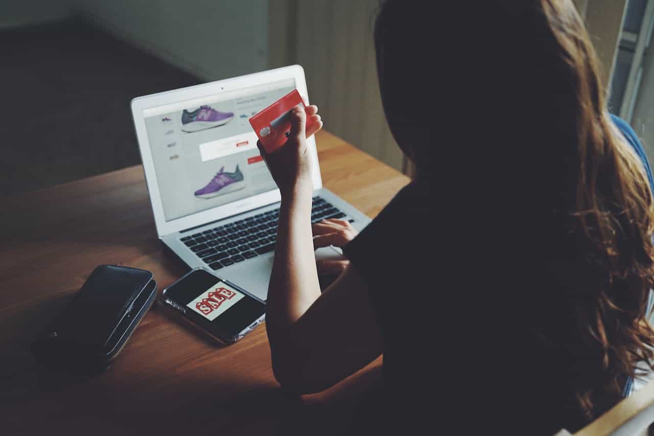
You spent the budget getting people to the site. The design works, the product pages convert, shoppers add to cart — and then a large share of them vanish at the very last step. It’s one of the most frustrating patterns in ecommerce, because the visitor already decided they wanted to buy. Something at checkout changed their mind.

The good news: most of that loss is recoverable, and a lot of it is a design and engineering problem rather than a marketing one. Baymard Institute’s long-running checkout research suggests that improving checkout design alone can lift conversion meaningfully — in the range of a third for many stores. This guide walks through the practical changes that move the needle, in roughly the order we’d tackle them on a client project: first remove friction, then build trust, then recover the sales that still slip away.
First, get the definitions straight
People use “cart abandonment” and “checkout abandonment” interchangeably, but they’re different problems with different fixes:
- Cart abandonment happens earlier — a shopper adds items, then leaves before starting checkout. Often a research or timing issue.
- Checkout abandonment happens at the final stage — they clicked “checkout” but didn’t finish. This is usually friction, surprise costs, or a trust wobble.
This guide focuses on the second, because it’s where the intent is highest and the fixes are most direct. A shopper who started checkout was ready. Your job is to not get in their way.

Part 1 — Remove friction from the flow
1. Kill surprise costs
The single most cited reason for abandonment is unexpected fees appearing at checkout — shipping, taxes, handling. If the price jumps at the last step, trust evaporates. Show shipping and tax estimates as early as possible, ideally on the cart or product page. Shoppers forgive a cost they saw coming; they punish one that ambushes them.
2. Shorten the flow
Baymard found the average checkout runs to about five steps. Every additional field and page is another chance to lose someone. Audit your flow and cut anything non-essential: do you really need a phone number, a company field, a “how did you hear about us”? If you don’t need it to complete the order, don’t ask for it now — send a survey later. Auto-fill and address lookup reduce manual typing, which matters enormously on mobile.
3. Offer guest checkout
Forcing account creation before purchase is one of the most reliable ways to lose a first-time buyer. Offer a guest option prominently, and let them create an account after the order with a single click (you already have their email). The account is for your benefit; don’t make it a tollgate in front of the sale.
4. Don’t redirect away to pay
Bouncing a customer to an external page to enter payment introduces doubt and load time at the worst possible moment. Keep the payment step on your own pages with embedded or hosted-but-seamless payment elements, so the experience feels continuous and the branding stays consistent.
5. Offer the payment methods people actually use
Flexible payment options matter more every year. Cards are table stakes; digital wallets (Apple Pay, Google Pay) dramatically cut friction on mobile because they skip manual entry entirely. For international audiences, local payment methods can be the difference between a sale and a shrug. Match the methods to your actual audience rather than adding everything.
Part 2 — Build trust at the moment of payment
6. Make security visible
Shoppers hesitate to hand over card details on a page that doesn’t feel safe. Visible trust signals — security badges, recognizable payment logos, HTTPS, a clean professional checkout — reassure at exactly the point hesitation peaks. This is as much design as it is engineering.
7. Be clear about returns and refunds
A visible, plain-language return and refund policy near the payment step reduces perceived risk. “Free returns within 30 days” does quiet conversion work. Hiding the policy in a footer link does the opposite.
8. Set delivery expectations
Unclear or disappointing delivery options drive a striking share of abandonment. Show estimated delivery dates and costs before the final step, and offer a couple of options where you can. Certainty converts.
9. Optimize for mobile and speed
A meaningful portion of abandonment is simply interruption, especially on phones. A checkout that’s slow, janky, or awkward to tap loses people who fully intended to buy. Test the real mobile experience on real devices, not just a narrow browser window, and treat page speed at checkout as a conversion feature, not a nicety.
Part 3 — Test, then recover what still slips away
10. A/B test the checkout itself
Checkout is too important to design once and forget. Test the number of steps, button copy, field order, shipping thresholds, and trust elements. Small, measured changes compound. The stores that win treat checkout as a living surface, not a fixed form.
11. Recover abandoned checkouts
Even a great checkout won’t hit 100%. For shoppers who left, a gentle, well-timed reminder email (and optionally a later incentive) recovers a real slice of revenue. Keep the first touch helpful rather than pushy — many people simply got interrupted and welcome the nudge.
12. Don’t forget the payments that fail silently
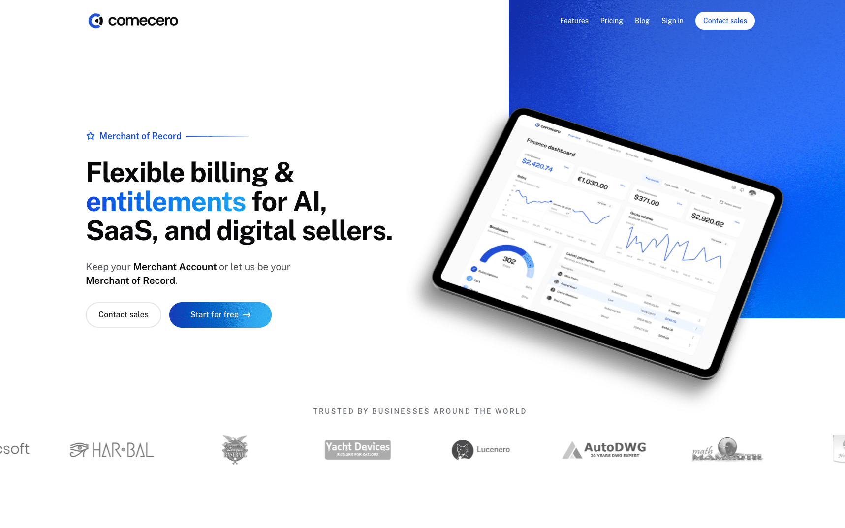
Here’s the leak most teams miss: not every lost sale is a shopper who chose to leave. For subscriptions and recurring billing especially, a large amount of revenue is lost to payments that simply fail — expired cards, temporary declines, network hiccups — and are never retried intelligently. Smart retry logic and clear, well-designed dunning (the follow-up flow when a payment fails) recover much of this without any new traffic. It’s worth making sure your billing or merchant-of-record layer handles this properly; some platforms, such as Comecero, treat failed-payment retries and checkout optimization as a core function rather than an afterthought.
A simple priority order
If you’re staring at a leaky checkout and don’t know where to start, work in this sequence:
- Eliminate surprise costs — usually the biggest single win.
- Add guest checkout and trim fields — fast, high-impact.
- Keep payment on-site with the right methods — removes doubt and dead ends.
- Add trust, clarity, and mobile polish — steadies the wobble.
- Test continuously and recover the rest — including silent payment failures.
Clarity, speed, and reassurance beat pressure every time. The goal isn’t to trick anyone into buying — it’s to get out of the way of people who already want to.
Frequently asked questions
What’s a “good” checkout abandonment rate? Benchmarks vary by industry, but most stores sit high enough that there’s meaningful room to improve. Rather than chasing an absolute number, track your own rate over time and measure the impact of each change.
What causes the most checkout abandonment? Consistently: unexpected costs at the final step, forced account creation, an overly long or confusing flow, and trust or payment-method gaps. Most are fixable with design and engineering changes rather than discounts.
Do discounts reduce abandonment? They can help, but clarity and confidence usually outperform discounts, and leaning on codes can train shoppers to wait for them. Fix friction first; use incentives surgically.
Is abandoned-cart email worth it? Yes — a timely, helpful reminder recovers a real share of otherwise-lost orders. Keep it useful rather than aggressive, and don’t lead with a discount on the first touch.
How does this differ for subscriptions? Subscription businesses lose significant revenue to failed recurring payments, not just human abandonment. Smart retries and good dunning flows recover much of that automatically, which is often a bigger win than front-end tweaks alone.
The bottom line
Checkout abandonment looks like a marketing problem but is mostly a craft problem: surprise costs, friction, doubt, and silently failing payments. Tighten the flow, earn trust at the moment of payment, test relentlessly, and put a real recovery process behind both human drop-off and failed transactions. Do that, and you convert demand you already paid for — which is almost always cheaper than going out to buy more.